
User Interface Design, What it IS and what is ISN’T
There are many in the digital space that can give you their interpretation of what UI Design is to them. But are they correct? In my experience, I will honestly say that about 2 out of 10 can define UI Design clearly.
So here is my version of what it is and what it is not. In the process of explanation, I have to compare UI to other disciplines so you understand.
Let’s start by defining UI.
According to Wikipedia, they define it as:
Interaction design, often abbreviated as IxD, is “the practice of designing interactive digital products, environments, systems, and services.” Beyond the digital aspect, interaction design is also useful when creating physical (non-digital) products, exploring how a user might interact with it. Common topics of interaction design include design, human-computer interaction, and software development. While interaction design has an interest in form (similar to other design fields), its main area of focus rests on behavior.
Rather than analyzing how things are, interaction design synthesizes and imagines things as they could be. This element of interaction design is what characterizes IxD as a design field as opposed to a science or engineering field.
That is a great summary but as a UI designer myself, I don’t think that the above is an entirely true “working” description.
I will define “working” in how UI design is currently being used.
In just about every UI designer position I have filled with companies in the last 10 years, UI design has really taken on more of a UX role as far as job duties.
To keep it simple, UX it how it FEELS and UI is how it LOOKS.
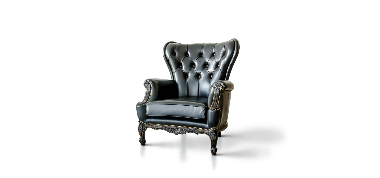
To tell the story Let say a furniture company decides to make a chair. and they have a UX and a UI designer on staff. The UX designer goes to work first.
This is what UX does:
1. Find out from stakeholders what kind of chair the company wants to make.
2. They then do some market analysis to make sure that some other company is not making the same thing and if so what are the details around the chair.
3. Find out who the chair is going to be made for; country, demographic(kids or adults), the income of customers.
4. Find out what type of chair, living room, kitchen, rocking, medical etc.
5. Based on the information gathered the UX Designer will then layout a structural “wireframe. this may include the height of the sitting surface, heights of the armrest, height of the back.
The UI Designer will do the following:
1. Review all the documentation and determine the material to use. Wood frame, steel frame, covering and other material to use in the overall look of the chair.
2. They will coordinate with the builders to find out how they plan on making the chair. The UI designer would define what colors of material. paint, fabric, and wood.
3. They will make sure that the chair will fit in with the brand and other products the company makes.
4. They may even create the packaging and instruction manual.
In the end both people are working toward the common goal of building a great chair that customers will enjoy.
Major Principals of UI Design to increase user satisfaction.
I would be surprised if anyone that is in the UX/UI or digital space hasn’t heard of Jakob Nielsen, Rolf Molich or Ben Shneiderman.
These Men have set outlines that if followed will ensure that whatever product you are building for a consumer use in the digital space will be successful in providing a good user experience.
Here are some guiding principals that all designers should follow.
System status
Mimic the real world
Mimicking the real world in certain situations may be difficult, but designers should strive to mirror what users naturally do when engaging with products in the real world. For example, when working on the Panera Kiosk we wanted to give users the same ordering process and mimic what customization options were available after making the main sandwich choice. If you can design your product to perform as close to what users expect to happen in the real world you will reduce the cognitive load.
Allow user to control the interface
Keep UI Elements Consistent
Reduce the potential for user error
Whenever possible, design interface systems so that potential errors are kept to a minimum. a simplified interface with the proper sequence of actions and information hierarchy may result in achieving error prevention. If an error has occurred show the user where and why. And how to fix it.
A well-designed interface can eliminate the potential for users to makes mistakes. Providing too many paths of action that are not defined will lead to the user to making unwanted mistakes.
Recognition rather than recall
When designers follow basic design structure that is purposeful, clear, and consistent from page to page or screen to screen. Designers should keep related items together this architecture will reduce cognitive load and the user will recall much faster and your interface will seem easy to use based on the simplicity of organization of information and task.
Flexibility and efficiency of use
Minimalist Design
Keep design of interface simple and easy to understand. Limit technical terms that users may not understand. Keep language relevant to user base.
Help menus for users
Help menus should be available if the user may not be able to understand certain sections of your web or app. An interface success may be measured by the ease of use without the use of help menus. The challenge is always making the interface easy to understand.